


Responsiveness in CSS

Published by
sanya sanya
Responsiveness in websites refers to the ability of a website to adapt and display properly on various devices and screen sizes, providing an optimal user experience.
It involves designing and developing websites in a way that ensures they can adjust their layout, content, and functionality based on the characteristics of the device being used to access them.
The goal of achieving the responsiveness is to make sure that users can easily navigate, read, and interact with a website regardless of whether they are using a desktop computer, laptop, tablet, smartphone, or any other device with different screen sizes and resolutions.
CSS Media Queries
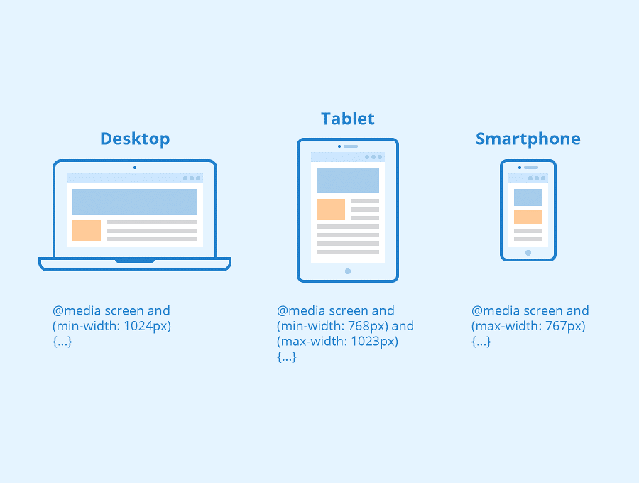
Media queries are a fundamental feature of CSS that enable developers to apply different styles and layouts based on various device characteristics such as screen size, resolution, and orientation.
Media queries allow you to create responsive designs that adapt and optimize the presentation of content for different devices and screen sizes.
Media queries are written using the @media rule followed by a media type and one or more expressions, which define the conditions under which the associated CSS rules should be applied.
@media media_type and (media_feature: value) { /* CSS rules */ }

Media Types
Media types specify the category of device or output being targeted. The most commonly used media types included are mentioned below -
- all - Applies to all devices.
- screen - Applies to screens, including desktops, laptops, tablets, and smartphones.
- print - Applies when printing a document.
- speech - Applies to screen readers and other speech synthesis devices.
Media Features
Media features define the characteristics of the targeted device. Some commonly used media features include are mentioned below -
- width - The width of the viewport.
- height - The height of the viewport.
- device-width - The width of the output device.
- device-height - The height of the output device.
- orientation - The orientation of the device either portrait or landscape.
- aspect-ratio - The ratio of the width to the height of the viewport.
- color - It represents the number of bits per color component.
- resolution - The resolution of the output device.
Flexbox and Grids Responsiveness
Flexbox is a powerful CSS layout model that enables flexible and responsive designs. It allows you to create responsive grids, align elements vertically and horizontally, and control the distribution of space among items.
Flexbox is particularly useful for building responsive navigation menus and flexible content containers.
.container { display: flex; justify-content: space-between; align-items: center; }
CSS Grid is another layout system in CSS that provides a two-dimensional grid structure. It allows you to create complex and responsive layouts with rows and columns.
CSS Grid enables precise control over the placement and sizing of elements within the grid, making it suitable for advanced responsive designs.
.container { display: grid; grid-template-columns: repeat(3, 1fr); gap: 20px; }
CSS Units for Responsiveness
Using relative units such as percentages, em, rem, or vw (viewport width) and vh (viewport height) instead of fixed pixels helps achieve responsiveness.
Relative units adjust their size relative to the parent element or viewport, allowing content to scale smoothly across different devices.
.element { font-size: 1.2em; width: 50%; padding: 2vw; }
Library
WEB DEVELOPMENT
Basic
HTML - Hyper Text Markup Language
CSS - Cascading Style Sheets
Cascading Style Sheets (CSS)
Selectors and Combinators
CSS Transforms
Units
CSS Icons and Colors
CSS Borders
CSS Margin
CSS Padding
CSS Dimensions
CSS Box Model
CSS Background
Pseudo Classes in CSS
CSS Positions
CSS Flexbox
Responsiveness in CSS
CSS Transitions
CSS Animations
Other CSS Properties
Var()
CSS Frameworks
CSS Grids
CSS Display Properties
JavaScript
Frontend
Backend
Interview Questions
FAANG QUESTIONS
On this page
CSS Media Queries
Media Types
Media Features
Flexbox and Grids Responsiveness
CSS Units for Responsiveness