


Other CSS Properties

Published by
sanya sanya
CSS math functions allow you to perform mathematical calculations and manipulate numeric values directly in your CSS stylesheets.
These functions can be useful for dynamically calculating values, creating responsive designs, and applying mathematical transformations.
Various CSS Math Functions are mentioned below -
- calc() - The calc() function performs mathematical calculations on values. It allows you to combine different units, perform addition, subtraction, multiplication, and division operations.
- min() - The min() function returns the smallest value among the provided arguments. It can be used to ensure a property doesn't exceed a certain limit.
- max() - The max() function returns the largest value among the provided arguments. It can be used to ensure a property doesn't go below a certain limit.
width: calc(100% - 20px); height: calc(50vh - 10%);
font-size: min(16px, 2vw); width: min(200px, 50%);
font-size: max(12px, 1.5rem); width: max(300px, 70%);
!important
The "!" important declaration is used to give a CSS property higher specificity, overriding any conflicting styles that may be applied to an element.
It is often used as a last resort when you want to ensure that a specific style is applied and cannot be overridden by other styles.
.example { color: red !important; }
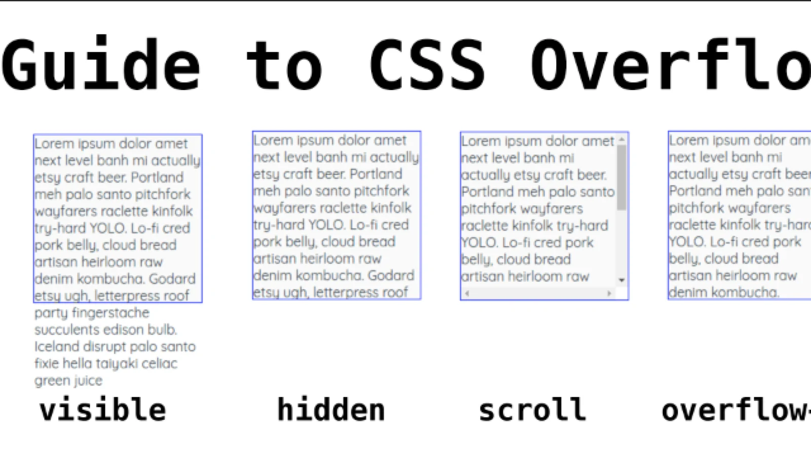
Overflow
In CSS, the overflow property is used to control how content is displayed when it exceeds the dimensions of its container.
It specifies whether to clip the content, add scrollbars, or automatically expand the container to accommodate the overflowing content.
The properties in the Overflow are mentioned below -
- visible - This value allows content to overflow its container without any clipping. The overflowing content may be partially or completely visible outside the container.
- hidden - With this value, any overflowing content is clipped and not displayed. It will be hidden from view.
- scroll - This value adds a scrollbar to the container, regardless of whether there is overflowing content or not. Users can scroll to view the hidden content.
- auto - This value automatically adds scrollbars to the container only when the content exceeds the container's dimensions. If the content fits within the container, no scrollbars are shown.
.container { width: 200px; height: 100px; overflow: scroll; }
CSS Gradients
CSS gradients are a powerful feature that allow you to create smooth transitions between two or more colors. Gradients can be applied to various CSS properties such as backgrounds, borders, and text.
There are two types of gradients commonly used in CSS: linear gradients and radial gradients.
Linear gradient
A linear gradient creates a transition between colors in a straight line. It has a starting point and an ending point, and the colors blend gradually from one point to the other.
.gradient { background: linear-gradient(to right, red, blue); }
Radial gradients
A radial gradient creates a transition from the center point to the outer edge in a circular or elliptical pattern. It's defined by a shape, size, and the colors that blend within the shape.
.gradient { background: radial-gradient(circle, yellow, orange); }
Shadow Effects
CSS provides several properties to create shadow effects for elements. Shadow effects can add depth and visual appeal to various components like text, boxes, and images.
There are two main types of shadow effects commonly used in CSS: box shadows and text shadows.
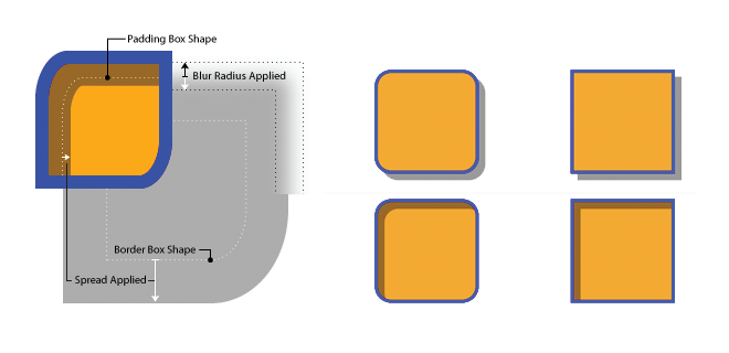
Box shadows :
The box-shadow property allows you to create a shadow effect around an element's box. It takes several values to define the shadow's color, offset, blur radius, and spread.
.box { box-shadow: 2px 2px 4px rgba(0, 0, 0, 0.3); }
Text shadows :
The text-shadow property allows you to apply a shadow effect to text. It takes similar values to the box-shadow property, specifying the color, offset, and blur radius of the shadow.
.text { text-shadow: 1px 1px 1px rgba(0, 0, 0, 0.5); }
Library
WEB DEVELOPMENT
Basic
HTML - Hyper Text Markup Language
CSS - Cascading Style Sheets
Cascading Style Sheets (CSS)
Selectors and Combinators
CSS Transforms
Units
CSS Icons and Colors
CSS Borders
CSS Margin
CSS Padding
CSS Dimensions
CSS Box Model
CSS Background
Pseudo Classes in CSS
CSS Positions
CSS Flexbox
Responsiveness in CSS
CSS Transitions
CSS Animations
Other CSS Properties
Var()
CSS Frameworks
CSS Grids
CSS Display Properties
JavaScript
Frontend
Backend
Interview Questions
FAANG QUESTIONS
On this page
!important
Overflow
CSS Gradients
Shadow Effects