


CSS Frameworks

Published by
sanya sanya
CSS frameworks are pre-designed libraries that provide a collection of CSS files and often accompanying JavaScript files.
They offer a set of predefined styles, components, and layouts that can be used to build websites or web applications more efficiently and consistently. CSS frameworks aim to simplify and streamline the process of styling and layout by providing a solid foundation of reusable code.
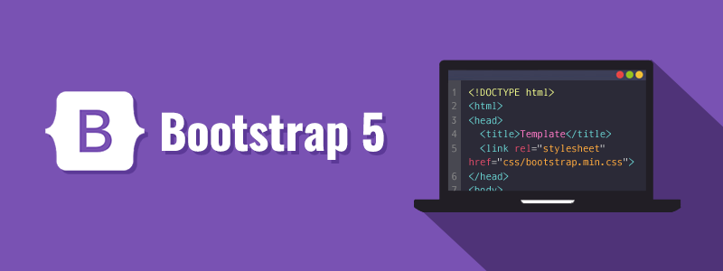
Bootstrap
Bootstrap is a popular CSS framework that provides a comprehensive set of tools, styles, and components for building responsive and mobile-first websites and web applications.
It was initially developed by Twitter and has gained widespread adoption due to its versatility and ease of use.
Some key features of Bootstrap are mentioned below -
- Responsive Grid System - Bootstrap includes a responsive grid system that allows you to create flexible and responsive layouts. The grid system is based on a 12-column layout, making it easy to create responsive designs that adapt to different screen sizes and devices.
- Pre-designed Components - Bootstrap offers a wide range of pre-built components, such as navigation bars, buttons, forms, modals, carousels, and more. These components are styled and ready to use, saving you time and effort in designing and styling common elements.
- Styling - Bootstrap provides a set of typography styles and utility classes that make it easy to control the appearance of text and other elements. It also offers a variety of predefined color schemes, CSS classes for spacing and alignment, and a flexible system for customizing the look and feel of your website.
Tailwind CSS
Tailwind CSS is a utility-first CSS framework that focuses on providing a highly customizable and flexible approach to styling web applications.
Unlike traditional CSS frameworks that offer pre-designed components, Tailwind CSS provides a vast collection of utility classes that can be combined to build custom designs.
Some key features of Tailwind CSS are mentioned below -
- Utility-First Approach - Tailwind CSS promotes a utility-first approach to styling. Instead of relying on predefined components, you compose your styles by applying utility classes directly to HTML elements. The framework offers a wide range of utility classes that control aspects such as margin, padding, typography, colors, flexbox, positioning, and more. By leveraging these utility classes, you have granular control over the appearance and behavior of your elements.
- Responsive Design- Tailwind CSS includes responsive utilities that allow you to easily create responsive designs. You can apply responsive classes to make elements adapt to different screen sizes or use breakpoint-specific utilities to control the appearance of elements at specific screen widths. This helps in building websites that are optimized for various devices and viewport sizes.
- Customization - Tailwind CSS is highly customizable. It provides configuration files that allow you to customize various aspects of the framework, such as colors, spacing, breakpoints, and more. You can define your own utility classes, extend or override existing styles, and tailor the framework to match your project's design system and requirements.

Library
WEB DEVELOPMENT
Basic
HTML - Hyper Text Markup Language
CSS - Cascading Style Sheets
Cascading Style Sheets (CSS)
Selectors and Combinators
CSS Transforms
Units
CSS Icons and Colors
CSS Borders
CSS Margin
CSS Padding
CSS Dimensions
CSS Box Model
CSS Background
Pseudo Classes in CSS
CSS Positions
CSS Flexbox
Responsiveness in CSS
CSS Transitions
CSS Animations
Other CSS Properties
Var()
CSS Frameworks
CSS Grids
CSS Display Properties
JavaScript
Frontend
Backend
Interview Questions
FAANG QUESTIONS
On this page
Bootstrap
Tailwind CSS